

Typography: The Unsung Hero of UI Design
Typography: The Unsung Hero of UI Design
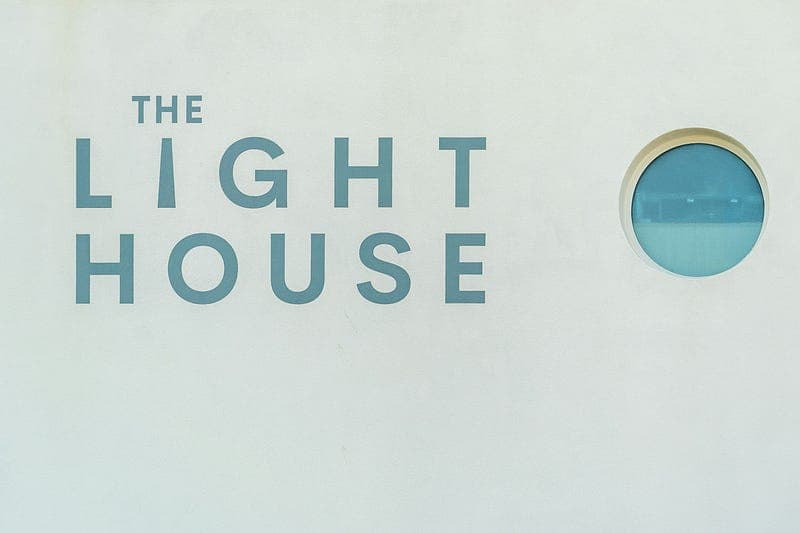
Photo by Nick Fewings on Unsplash
When it comes to web design, typography often doesn’t get the attention it deserves. However, choosing the right fonts and arranging text properly can make a significant difference in the overall user experience and effectiveness of your website.
Today, we’ll explore the importance of typography and how to use it to create an engaging and readable web design.
Why Typography Matters
- Readability: The primary purpose of text is to be read. Proper typography ensures that your content is easy to read and digest.
- Hierarchy: Typography helps establish a visual hierarchy, guiding users through the content in a logical order.
- Brand Voice: Fonts can convey the personality of your brand. For instance, a serif font might suggest tradition and reliability, while a sans-serif font might convey modernity and simplicity.
- Aesthetic Appeal: Good typography enhances the visual appeal of your website, making it more attractive and engaging.
Key Principles of Typography in Web Design
Font Choice: Select fonts that reflect your brand identity and are easy to read. Stick to a maximum of two or three fonts to maintain consistency.
Serif Fonts: Good for traditional and formal designs.
- Sans-Serif Fonts: Ideal for modern and minimalist designs.
Display Fonts: Best for headlines and decorative purposes.
Font Size and Scale: Create a clear hierarchy with different font sizes for headings, subheadings, and body text. Typically, a larger font size for headings and a smaller size for body text is effective.
Headings: 32px and above
- Subheadings: 24px to 32px
Body Text: 16px to 18px
Line Height and Spacing: Ensure sufficient line height and spacing to improve readability. Too tight or too loose spacing can hinder readability.
Line Height: 1.5 to 1.8 times the font size
Paragraph Spacing: Maintain clear separation between paragraphs.
Contrast: Ensure high contrast between text and background. Dark text on a light background is generally the easiest to read.
Example: Black or dark gray text on a white or light gray background.
Alignment: Align text consistently. Left alignment is most common for Western languages, but center or right alignment can be used for specific design effects.
Practical Application: Typography in Action
Let’s look at how to apply these principles to design a compelling landing page.
Choose Fonts Wisely
Primary Font: A clean sans-serif font like Helvetica or Arial for the body text.
Secondary Font: A decorative serif font for headings and subheadings.
Establish a Clear Hierarchy
Headings (H1): Use a large, bold font (e.g., 36px) to grab attention.
- Subheadings (H2): Slightly smaller and less bold (e.g., 28px).
Body Text: Maintain a readable size (e.g., 18px) with adequate line height.
Maintain Consistent Spacing
Ensure that line height and paragraph spacing are consistent to improve readability.
Ensure Contrast
Use a high-contrast color scheme. For example, dark blue text on a white background.
Alignment
Stick to left alignment for body text for easy readability.
Testing and Refining Your Typography
After implementing your typography, test it on different devices and screen sizes to ensure it looks good everywhere. Get feedback from users and make adjustments as necessary.
Conclusion
Typography is a critical aspect of web design that can greatly enhance user experience and engagement. By understanding and applying the principles of font choice, size, spacing, contrast, and alignment, you can create a visually appealing and highly readable website. Join me tomorrow for the final day of our series, where we’ll discuss the importance of accessibility in web design.